You can have the perfect prints, beautiful frames, and a great wall—yet something still feels… off.
Maybe the pieces look too scattered. Maybe everything feels slightly too high. Or maybe the wall just doesn’t feel “finished.”
The truth is, arranging wall art is less about the pieces themselves and more about how they work together. Once you understand a few core principles, everything starts to click.
Why Wall Art Arrangement Matters More Than You Think
Wall art isn’t just decoration—it shapes how a space feels.
-
A well-arranged wall can make a room feel bigger and more balanced
-
A poor layout can make even expensive art look awkward
-
Placement affects where your eyes go first (your focal point)
The same artwork can look completely different depending on how you arrange it.
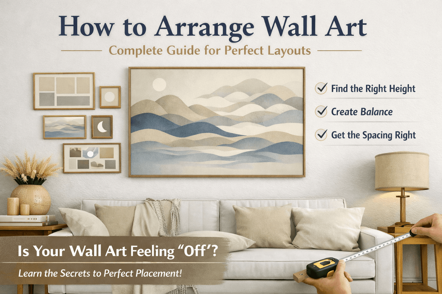
Basic Rules for Arranging Wall Art (Start Here)
Before trying creative layouts, get these fundamentals right:
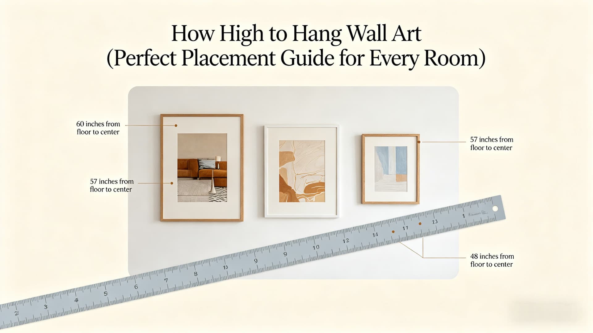
1. Hang at Eye Level
The center of your artwork should sit around 145–150 cm (57–60 inches) from the floor. This keeps everything naturally aligned with your line of sight.
2. Keep Spacing Consistent
For multiple pieces, aim for:
- 5–8 cm (2–3 inches) between frames
Consistency matters more than the exact number.
3. Align Intentionally
Choose one:
-
Edge alignment (clean and structured)
-
Center alignment (more flexible and modern)
Don’t mix both randomly.
4. Balance the Visual Weight
It’s not just about size—dark frames, bold art, and large pieces all carry more “weight.”
Try to distribute them evenly so one side doesn’t feel heavier than the other.
Different Wall Art Layout Ideas You Can Use
Choosing the right layout makes everything easier. Here are the most common options:
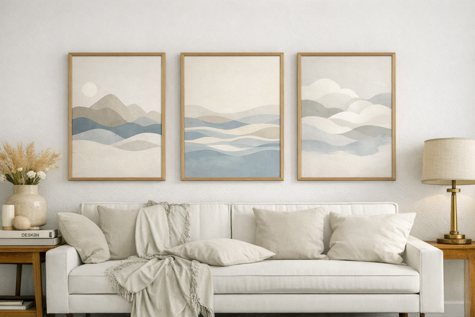
Symmetrical Layout
Perfect for a clean, formal look. Think two or four frames evenly spaced.
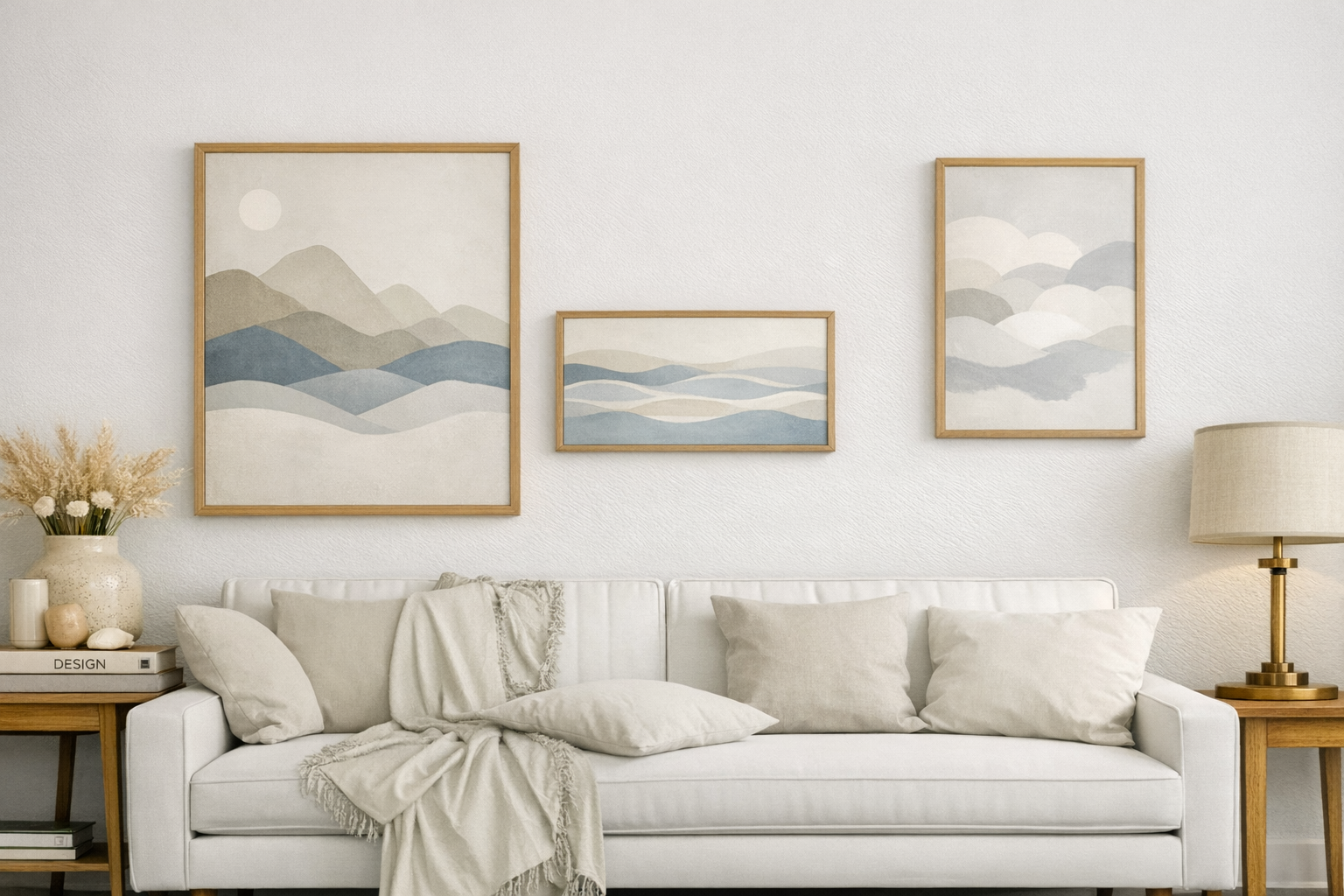
Asymmetrical Layout
More relaxed and modern. Great for mixing different sizes and styles.
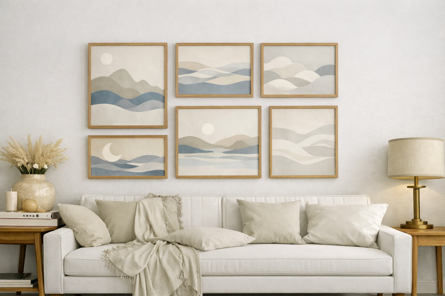
Grid Layout
The easiest to get right. Use frames of the same size arranged in rows (like 2×2 or 3×3).
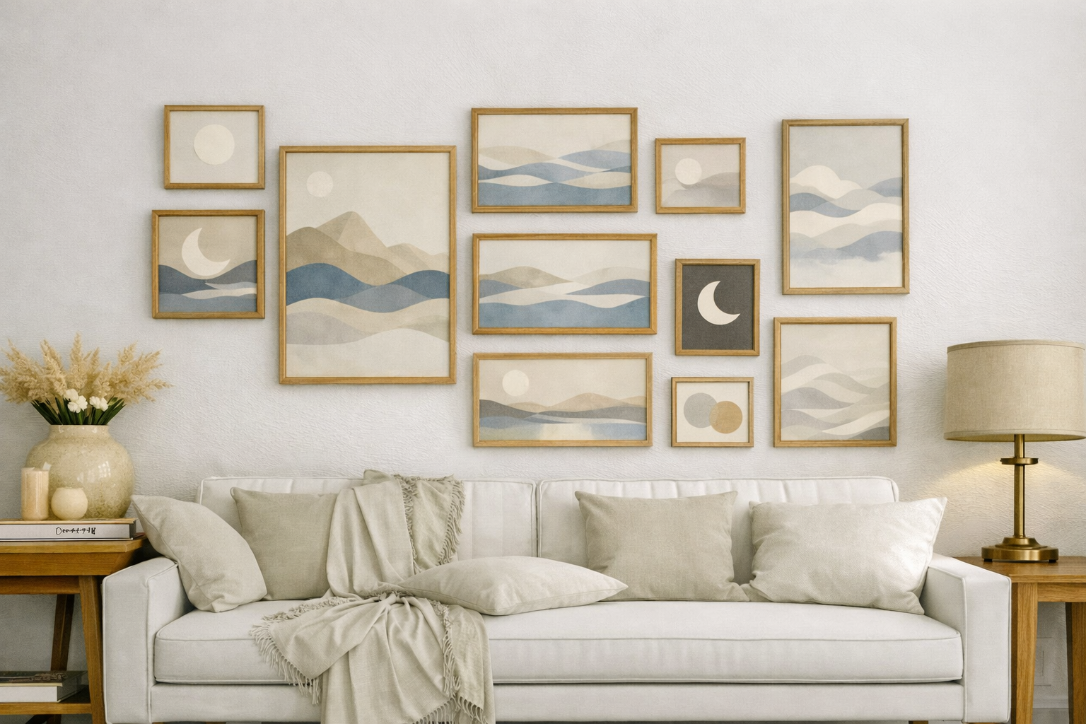
Gallery Wall
A curated mix of different pieces. This is the most popular style—but also the easiest to get wrong without planning.
Single Statement Piece
One large artwork can often look stronger than many small ones—especially in minimalist spaces.
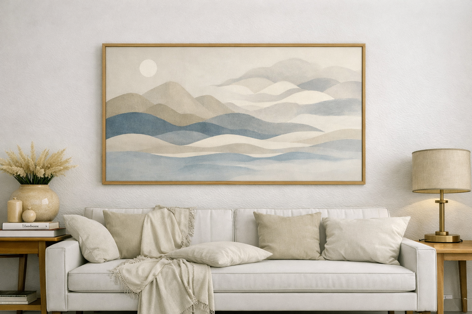
How to Arrange Wall Art Above a Sofa or Bed
This is one of the most searched—and most misdone—areas.
Follow the 2/3 Rule
Your wall art should take up about two-thirds the width of the furniture below it.
Don’t Hang Too High
Leave about:
- 15–25 cm (6–10 inches) between the furniture and the artwork
Center It Properly
Always align your layout with the center of the sofa or bed—not the wall.
How to Space Wall Art Correctly
Spacing is where most layouts fail.
-
Small frames → closer spacing (5 cm)
-
Larger frames → slightly wider spacing (up to 8 cm)
-
Mixed layouts → keep spacing visually consistent
A simple trick: Lay everything on the floor first and adjust before committing to the wall.
Common Mistakes to Avoid When Arranging Wall Art
Even small mistakes can throw everything off:
-
Hanging artwork too high
-
Using frames that are too small for the wall
-
Inconsistent spacing between pieces
-
Ignoring how the art relates to furniture
Most of these issues only become obvious after hanging—so planning ahead matters.
How to Preview Your Wall Art Layout Before Hanging
One of the biggest mistakes people make is going straight from idea to nails in the wall.
Instead of guessing, it helps to see your layout before you commit.
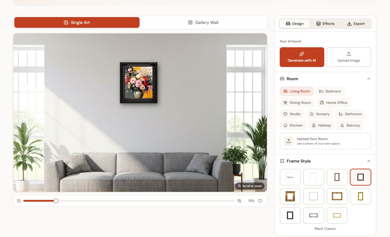
-
Place your artwork on realistic room walls
-
Adjust size and positioning
-
Try different frame styles
-
Build full gallery wall arrangements
This makes it much easier to spot problems early—and get the layout right the first time.
Tips for Creating a Balanced Gallery Wall
If you're going for a gallery wall, keep these in mind:
-
Start from a central anchor piece
-
Mix sizes, but keep spacing consistent
-
Stick to a limited color palette
-
Leave some empty space—it helps everything breathe
A gallery wall should feel curated, not crowded.
Final Thoughts: Start Simple and Adjust as You Go
Arranging wall art doesn’t have to be complicated.
Start with a simple layout. Focus on spacing and alignment. And most importantly—see how it looks before you commit.
A few small adjustments can turn a wall from “something’s off” into something that feels just right.