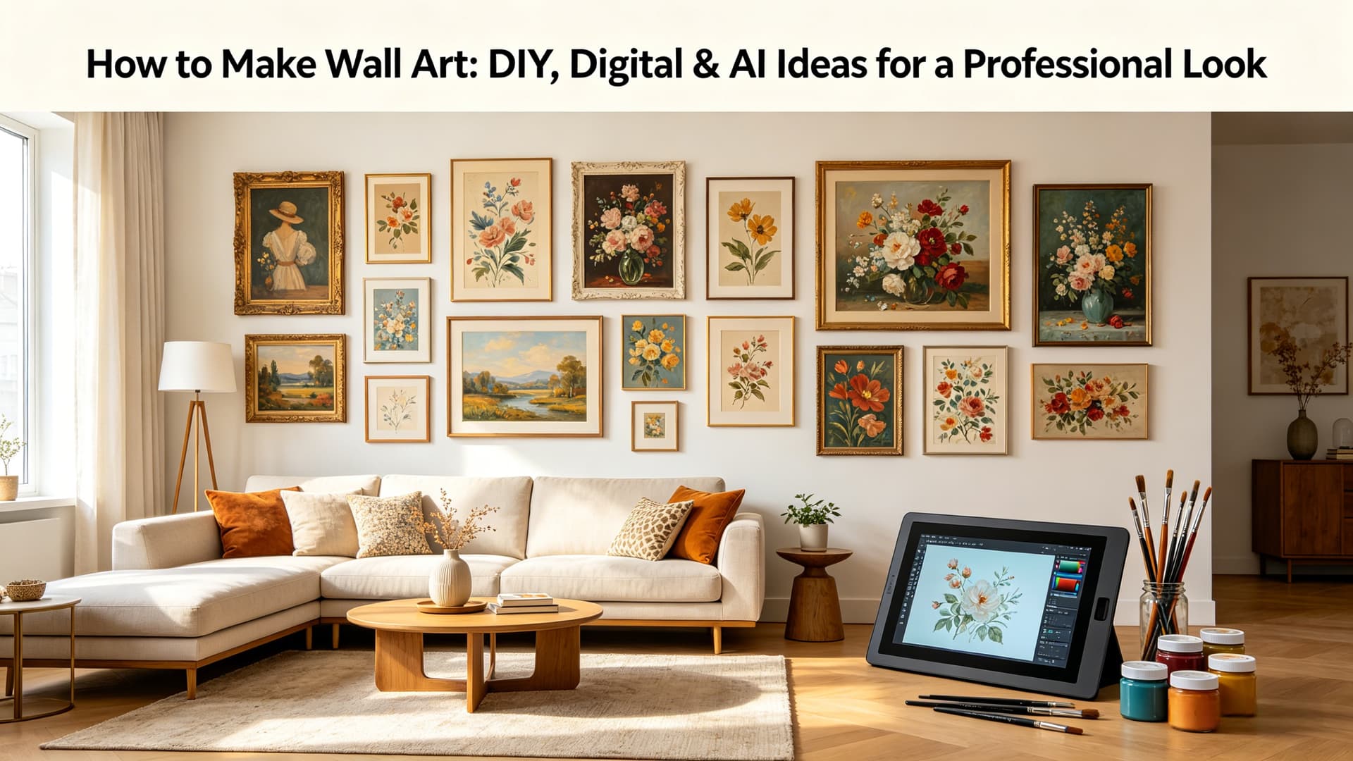
Creating a gallery wall feels easy—until you actually try it.
You pick a few prints you love, hang them up, step back… and something just feels off. The spacing looks weird, the styles don’t quite match, or the whole thing feels more cluttered than curated.
If that sounds familiar, you’re not alone.
The truth is, a good gallery wall isn’t about having better art—it’s about choosing the right pieces together, with a clear plan in mind.
In this guide, I’ll walk you through exactly how to choose art for a gallery wall that looks cohesive, intentional, and actually fits your space.
Why Choosing the Right Art for a Gallery Wall Matters
A gallery wall isn’t just decoration—it becomes the visual center of your room.
When it works, everything feels pulled together. When it doesn’t, it quietly throws the whole space off.
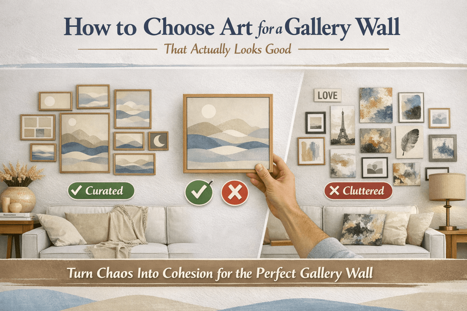
The most common mistake people make is adding pieces one by one over time, without thinking about how they relate to each other. Each piece might look good on its own—but together, they don’t tell a clear story.
That’s why choosing your gallery wall art as a system, not as individual pieces, makes all the difference.
How to Choose a Theme for Your Gallery Wall Art
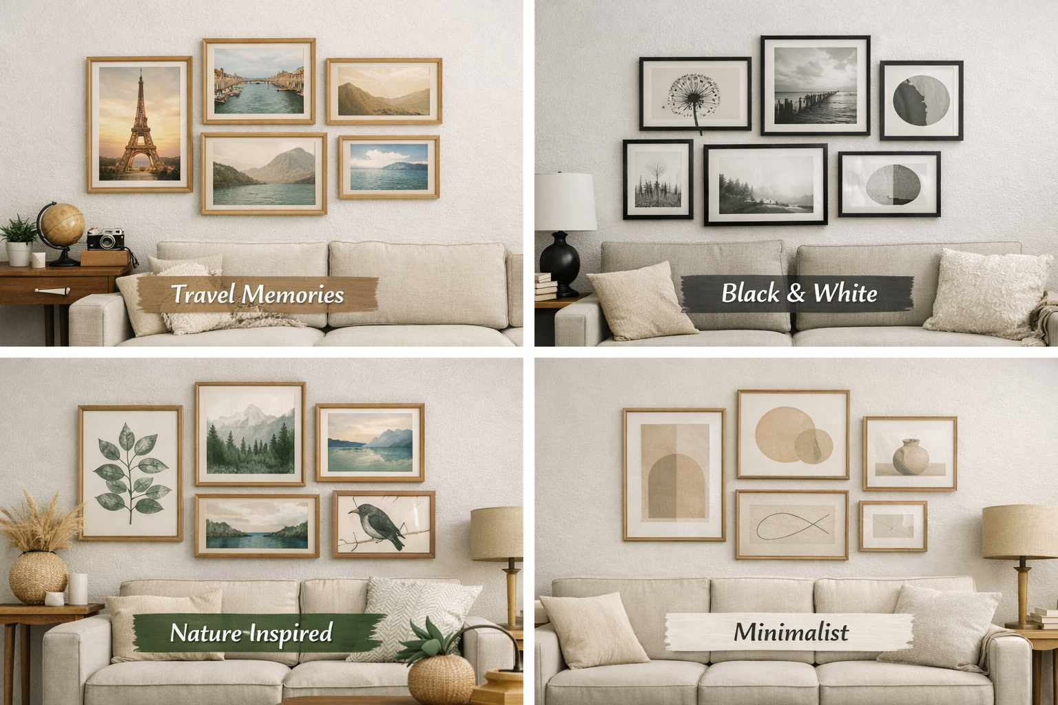
This doesn’t mean your wall has to be overly “designed” or rigid. A theme simply gives you a filter—something that helps you decide what belongs and what doesn’t.
For example:
-
A travel-themed wall filled with places you’ve been
-
A black-and-white collection for a clean, modern feel
-
A nature-inspired wall with botanical or landscape art
-
A minimalist setup with soft colors and simple forms
Think about the feeling you want when you walk into the room. Calm? Creative? Energetic? Your theme should support that mood.
If you’re stuck, one trick that helps is quickly testing different visual directions before committing. Even just seeing a few styles side by side can make your decision much clearer.
How to Choose the Right Art Styles for a Gallery Wall
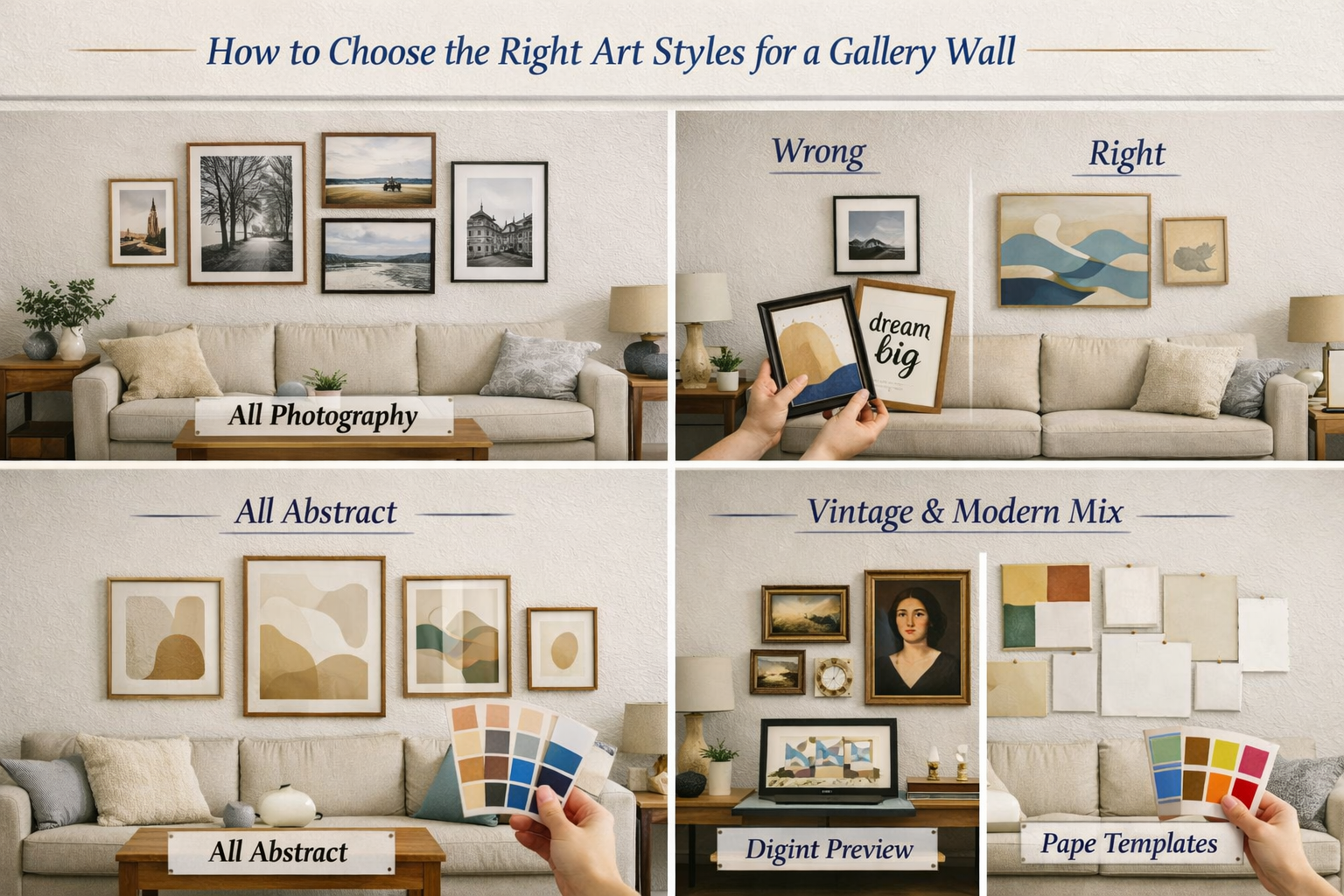
A lot of people worry about whether everything needs to match perfectly. The short answer is: no—but it does need to feel connected.
If you want a safe, polished look
Stick to one style:
-
All photography
-
All abstract
-
All line art
This is the easiest way to get a clean, cohesive result.
If you want something more interesting
Mix styles—but do it intentionally.
For example:
-
Pair photography with abstract art
-
Combine typography with illustrations
-
Mix modern pieces with vintage accents
What makes this work is having a “common thread.” That could be color, subject, or even the type of frames you use. You can quickly unify mismatched photos and artworks with AI image style transfer to lock in a consistent artistic thread across all pieces. Without that, a mixed gallery wall can quickly feel random instead of curated.
Without that, a mixed gallery wall can quickly feel random instead of curated.
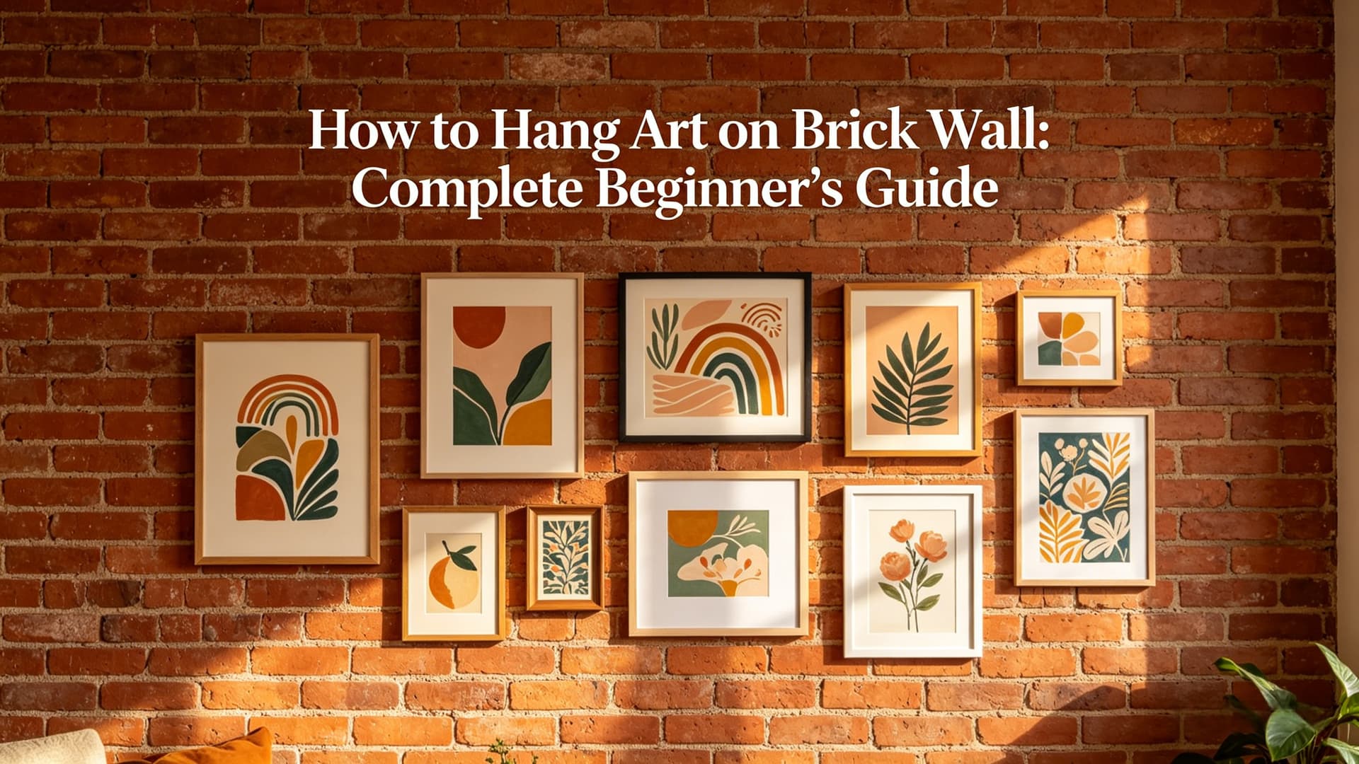
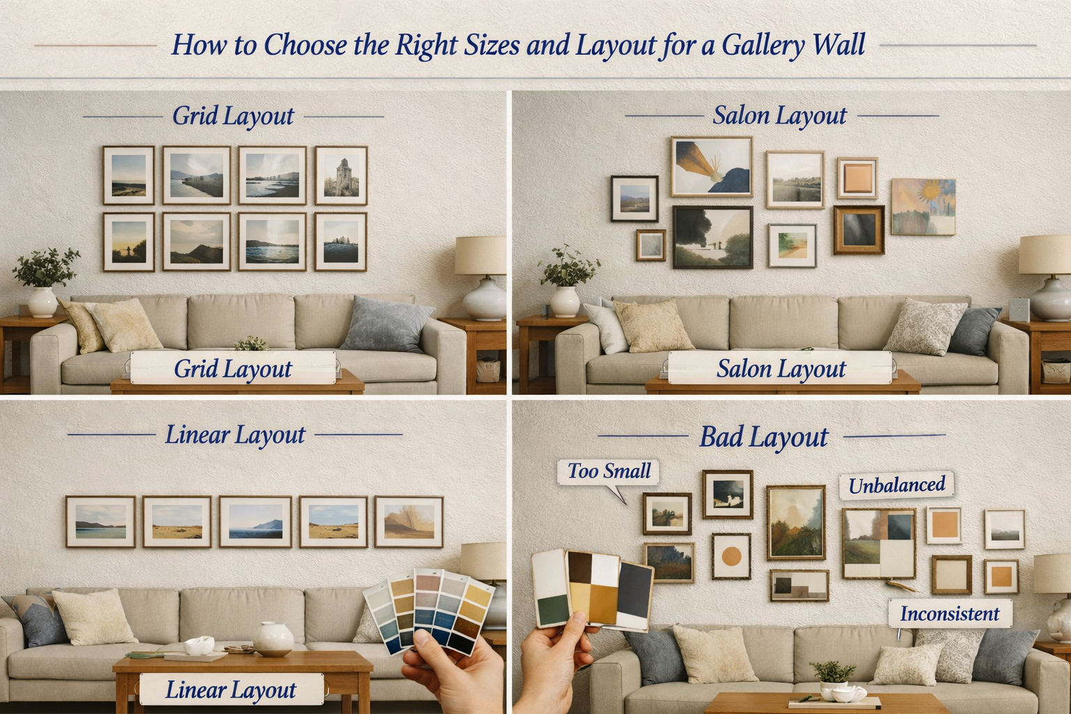
How to Choose the Right Sizes and Layout for a Gallery Wall
You hang everything up, and suddenly:
-
The spacing feels uneven
-
The layout looks awkward
-
Nothing really “anchors” the wall
That usually comes down to size and layout decisions.
Start with a focal point
Pick one larger piece as your anchor.
This is the piece your eye lands on first. Everything else should support it—not compete with it.
Then choose a layout style
Grid layout Frames are the same size and aligned in rows. → Very clean, very forgiving.
Salon (freeform) layout Different sizes arranged more organically. → Looks great, but takes more planning.
Linear layout Frames in a straight line. → Perfect for narrow spaces like hallways.
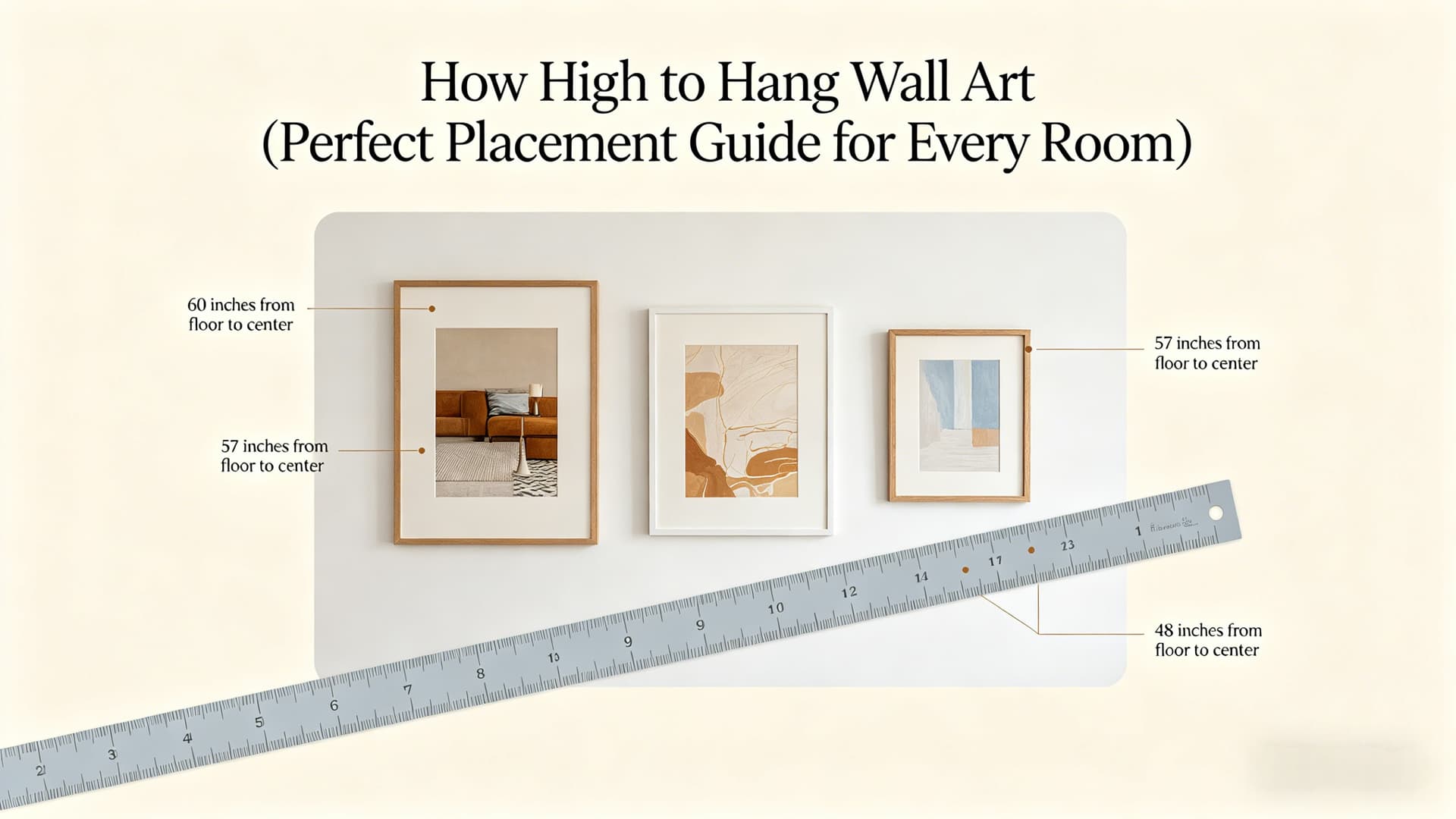
A small detail that makes a big difference
Spacing.
Most people either:
-
Put pieces too close together → feels cramped
-
Or too far apart → feels disconnected
A good rule of thumb is 2–3 inches between frames. It sounds minor, but it completely changes how the wall feels.
How to Match Colors for Gallery Wall Art (Like a Designer)
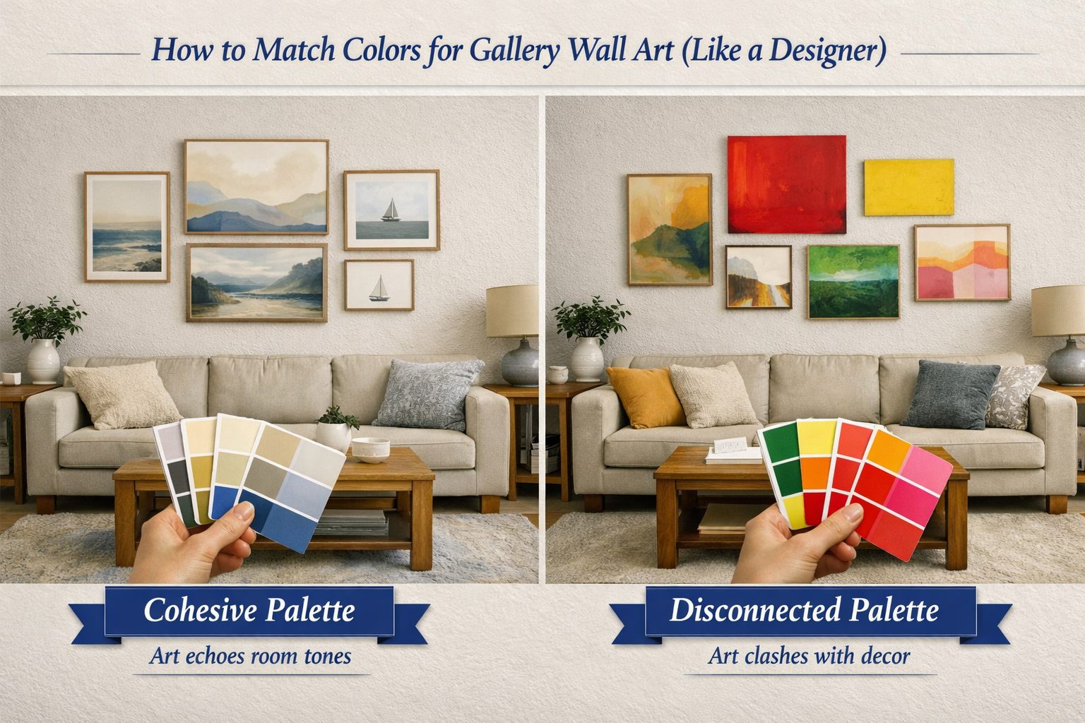
And this is where a lot of people overthink—or underthink.
The easiest approach: keep it simple
If you’re unsure, start with a limited palette.
For example, black, white, and neutral tones are incredibly forgiving. They work in almost any space and won’t compete with your furniture.
This is especially effective in modern interiors where you want the wall to feel calm rather than overwhelming.
A slightly more advanced approach
Use contrast—but with control.
Let’s say your room already has warm tones (wood, beige, soft lighting). Adding a few cooler-toned artworks can create visual interest—without clashing.
The most overlooked trick
Look at your room first.
Your gallery wall shouldn’t exist in isolation. It should connect to what’s already there:
-
The color of your sofa
-
The tones in your rug
-
Even small details like cushions or decor
When your wall art “echoes” these colors, the whole room starts to feel intentional.
How to Choose Frames for a Cohesive Gallery Wall Look
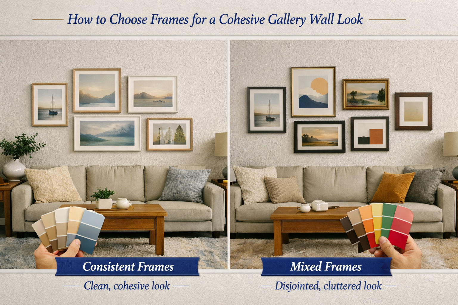
They can either unify your wall or make it feel disjointed.
If you want a clean, modern look
Use consistent frames:
-
Same color (black, white, or wood)
-
Same thickness
-
Same material
This instantly makes everything feel more organized.
If you prefer a more relaxed, artistic feel
Mix frames—but with some control.
For example:
-
Combine wood and black frames
-
Use different textures, but keep a similar tone
The goal isn’t randomness—it’s controlled variation.
How to Plan and Preview Your Gallery Wall Before Hanging
This is the step most people skip—and regret.
Because once you start drilling holes, fixing mistakes becomes annoying very quickly.
If you’ve ever hung a gallery wall and thought, “Something looks off… but I can’t quite tell what,” you’ve already experienced this.
The traditional way (and its limits)
People usually:
-
Cut paper templates and tape them to the wall
-
Or arrange frames on the floor
These help—but they still involve a lot of guessing.
A smarter way to do it
Instead of imagining how it might look, you can preview it first.
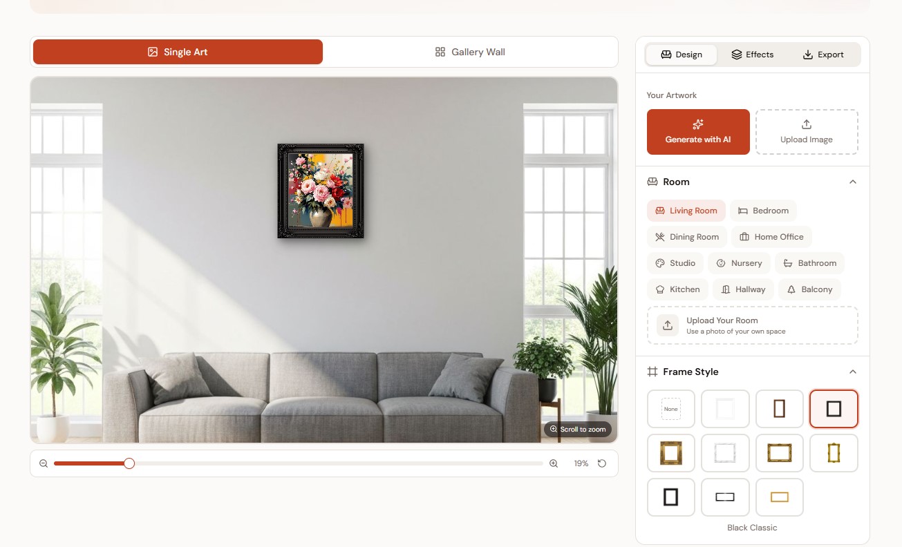
-
Generate artwork in different styles
-
Place it on realistic room walls
-
Try different layouts and frame combinations
So instead of committing too early, you can experiment freely and see what actually works.
The process becomes much more forgiving:
Create → Preview → Adjust → Then hang
And that alone can save you from a lot of trial and error.
Common Gallery Wall Art Mistakes to Avoid
Even with good taste, a few small mistakes can throw everything off:
-
Choosing pieces that don’t relate to each other
-
Not having a clear focal point
-
Inconsistent spacing
-
Using too many small frames
-
Ignoring the size of the wall
Most of these aren’t obvious until you step back—which is why planning matters so much.
Final Tips for Creating a Perfect Gallery Wall Layout
If you want your gallery wall to look like it was professionally designed, keep these in mind:
-
Start from the center and build outward
-
Keep spacing consistent
-
Limit your color palette
-
Don’t rush the process
And most importantly:
👉 Test your layout before you commit.
A little extra planning upfront can make the difference between “this looks okay” and “this looks amazing.”
Conclusion
Choosing art for a gallery wall isn’t about following strict rules—it’s about making intentional decisions.
When your theme, colors, sizes, and layout all work together, the result feels effortless—even though it’s carefully planned.
Take your time, experiment with different combinations, and don’t be afraid to adjust along the way.
That’s how you create a gallery wall that not only looks good—but actually feels right in your space.