A gallery wall can be the most personal design element in your home -- or an uneven mess of random frames. The difference almost always comes down to layout. After studying dozens of designer-created gallery walls and testing arrangements in real spaces using our gallery wall mockup tool, these are the 10 templates that consistently deliver stunning results.
Each template below includes the recommended number of pieces, ideal wall size, and the rooms where it works best.
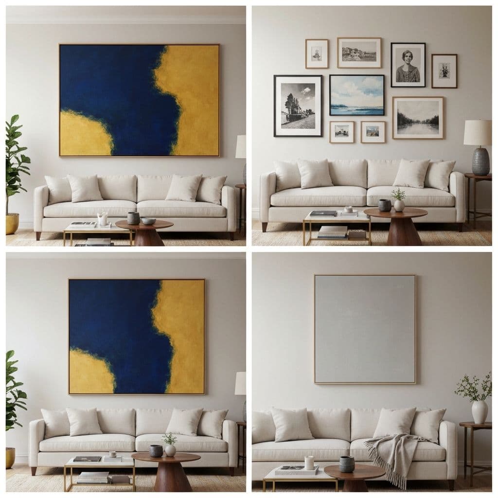
1. The Classic Grid
Equal-sized frames in a mathematically perfect grid. Start with 4, 6, or 9 pieces, all using identical frames. This layout communicates order and intention, making it ideal for modern and contemporary interiors.
Works best in: Living rooms, home offices, and hallways. The grid format is forgiving because alignment is everything -- get the spacing right (2-3 inches between frames) and it practically hangs itself.
Art to use: A cohesive series works best here. Consider a set of black-and-white city photographs, a seasonal botanical collection, or abstract compositions in a single color family. The uniformity of the grid means the art inside each frame can vary while still looking intentional.
2. The Asymmetric Cluster
Five to seven different-sized frames arranged around an invisible center point, creating organized chaos. The trick is including one large anchor piece (about 40% of the total display width) and filling around it with smaller works.
Works best in: Living rooms and dining rooms with at least 6 feet of wall space. This layout feels collected over time -- like you have been gathering art for years -- which gives it authentic personality.
Planning tip: Cut paper templates for each frame, tape them to the wall, and adjust until the overall shape feels balanced. Or skip the paper and plan digitally with a mockup tool first.
3. The Horizontal Row
Three to five frames in a straight horizontal line, all with their centers aligned at the same height. Simple, clean, and impossible to get wrong. Keep all frames the same height but vary the width slightly for subtle visual interest.
Works best in: Above a sofa, bench, or credenza. The horizontal emphasis echoes the furniture below and creates a unified visual band. This is particularly effective in living rooms where you want art presence without complexity.
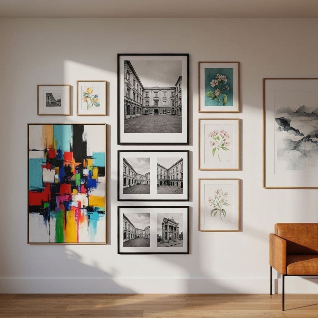
4. The Salon Style
Borrowed from 19th-century Parisian art salons, this approach fills an entire wall from near-floor to near-ceiling with frames of every size. It is the most dramatic gallery wall template and requires the most pieces (typically 12-20).
Works best in: Large living room walls, stairwells, and dining rooms with high ceilings. Start with the center row at eye level (57 inches from the floor), place your largest piece first, then build outward in all directions. Mix frame finishes for an eclectic feel.
Struggling with placement? See what your salon wall could look like before hanging anything -- our mockup tool lets you visualize the entire composition on your actual wall.
5. The Staircase Cascade
Frames that follow the diagonal angle of a staircase, stepping upward along the incline. Use 5-8 pieces in consistent frames but varied art. Maintain equal diagonal spacing -- measure the distance between frame centers, not edges.
Works best in: Obviously, staircases. But also angled hallways and split-level transitions. Japanese woodblock-style prints or a series of nature photographs create a visual journey as you ascend.
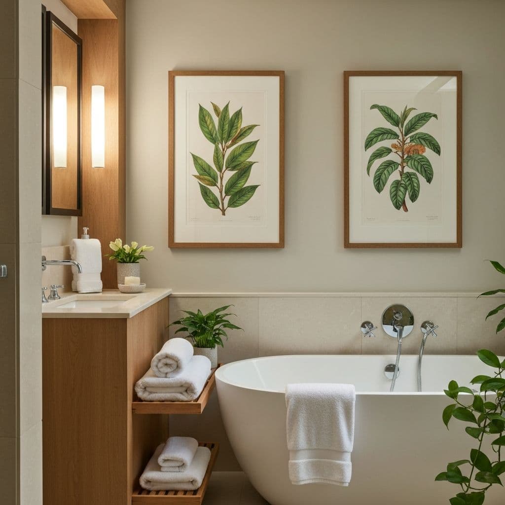
6. The Vertical Stack
Two or three frames stacked vertically in a narrow space. Choose tall, portrait-oriented prints and align them with equal spacing. This arrangement draws the eye upward and makes ceilings appear taller.
Works best in: Narrow walls between windows, bathroom walls next to mirrors, and galley kitchen end walls. For bathroom wall art, consider moisture-safe printing options -- this layout style is one of our top bathroom art recommendations.
7. The Triptych
One continuous image split across three canvases, with 1-2 inch gaps between panels. This transforms a single artwork into a cinematic panoramic experience. The split adds visual rhythm that a single canvas cannot achieve.
Works best in: Above beds, sofas, and dining tables. Landscapes, ocean horizons, and abstract color gradients are natural triptych subjects. You can generate panoramic art specifically designed for triptych splitting with our custom art tools.
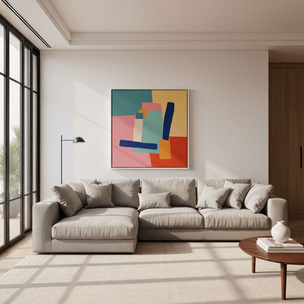
8. The Statement + Satellites
One oversized piece as the hero, flanked by 2-4 smaller frames on either side or arranged asymmetrically around it. The large piece carries the visual weight while the satellites provide context and detail.
Works best in: Bedrooms (above the headboard), living rooms, and home offices. Choose a bold large-format piece for the center and quieter works for the supporting cast.
9. The Ledge Display
Install floating picture ledges and lean frames against the wall at different depths. Layer smaller pieces in front of larger ones. Add non-art objects -- a small plant, a decorative object, a candle -- to create dimension.
Works best in: Any room where you want maximum flexibility. Swap art seasonally using printable downloads without committing to permanent nail holes. This is the most dynamic gallery approach because rearranging takes seconds.
10. The Mixed Media Wall
Combine framed prints, unframed canvases, mirrors, small floating shelves, and dimensional objects on a single wall. The key constraint: maintain a unified color story (2-3 accent colors maximum) so the diverse media feels cohesive rather than chaotic.
Works best in: Living rooms and dining rooms where you want conversation-starting visual interest. This is the most personal approach -- no two mixed media walls are alike.
Planning Your Gallery Wall: The Process
Regardless of which template you choose, follow these steps to avoid frustration:
- Choose your template from the 10 options above based on your wall size and room style
- Select your color palette -- pull 2-3 colors from existing room elements (pillows, rugs, curtains)
- Plan digitally using a gallery wall mockup tool to test arrangements on-screen
- Create paper templates the exact size of each frame and tape them to the wall
- Live with the paper layout for 2-3 days before hammering any nails
- Hang from center outward, starting with the largest or most central piece
The single biggest gallery wall mistake is rushing to hang without planning. Whether you use paper templates on the wall or a digital mockup tool, spending 30 minutes planning saves hours of regret and unnecessary nail holes.
Looking for art to fill your gallery wall? Explore room-specific generators for living rooms, bedrooms, and dining rooms, or browse our 25 living room wall art ideas for more inspiration.