The living room is where first impressions are formed. It is the room guests see first, the space where families gather, and usually the largest continuous wall area in any home. Yet so many living rooms have bare walls or a single uninspired poster that does nothing for the space. Interior designers know that wall art is one of the most powerful (and cost-effective) tools for transforming a room from ordinary to magazine-worthy.
We consulted with interior stylists and studied hundreds of real-world living room makeovers to compile these 25 approaches. Whether your style is modern minimalist or eclectic maximalist, there is an idea here for you.
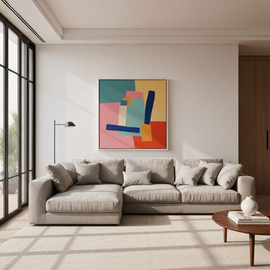
Oversized Statement Pieces
Nothing anchors a living room like one bold, large-scale artwork above the sofa. Designers call this the "hero piece" strategy: a single canvas or framed print that is large enough to command attention from anywhere in the room.
1. The Giant Abstract
A 48x72-inch abstract painting in colors pulled from your throw pillows or rug. The trick is choosing 2-3 accent colors already present in the room so the art looks curated, not random. Warm-toned abstracts (ochre, terracotta, burnt sienna) pair beautifully with neutral sofas and wooden furniture.
2. Panoramic Landscape Photography
A wide-format nature photograph -- think mountain ranges, ocean horizons, or forest canopies -- creates instant depth. Printed on canvas at 60 inches wide, it becomes a window to another world. Black-and-white panoramas work especially well in monochrome or Scandinavian interiors.
3. Oversized Botanical Close-Up
A single flower or leaf photographed macro-style and blown up to wall size. Think Georgia O'Keeffe but photographic. The result is both dramatic and organic -- perfect for rooms with natural materials like linen, jute, and raw wood.
4. The Textured Canvas
Thick brushstrokes or palette knife techniques give a painting physical depth you can see from the side. This is where oil painting textures excel -- even AI-generated art can capture that impasto quality when printed on textured canvas.
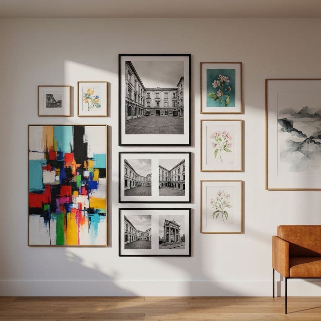
Gallery Walls That Feel Collected, Not Cluttered
Gallery walls remain one of the most popular living room art approaches, but they are easy to get wrong. The key is planning your layout digitally before committing to nail holes. A gallery wall mockup tool lets you experiment with arrangements on-screen first.
5. The Curated Collection (5-7 Pieces)
Choose a color story first, then select pieces that fit within it. A collection might include two abstract prints, one botanical, one line drawing, and one photograph -- unified by a shared palette of sage green and cream. Keep 2-3 inches between frames for visual breathing room.
6. The Symmetric Grid
Four or six identical-sized frames in a perfect grid. Fill them with a cohesive series: seasonal botanicals, city skylines from different angles, or variations on an abstract theme. The grid itself provides order, so the art inside can be more expressive. For layout techniques, see our guide to gallery wall layouts.
7. The Salon-Style Floor-to-Ceiling Wall
Borrowed from Parisian art salons, this approach fills an entire wall with frames of different sizes. Start by placing the largest piece slightly above center, then build outward. Mix frame finishes -- black, white, natural wood -- for an eclectic feel. This works best on walls at least 8 feet wide with no competing furniture.
8. The Ledge Gallery
Install two or three picture ledges and lean art against the wall. The beauty is flexibility: swap pieces seasonally, overlap frames, and add dimensional objects like small plants or candles. This is the most forgiving gallery approach because nothing requires precise placement.
Minimalist and Modern Approaches
9. Single Line Art Portrait
A continuous line drawing of a face or figure, printed large on white paper in a simple black frame. Minimalist art like this is deceptively impactful -- it reads as sophisticated and intentional without competing with the rest of the room.
10. Color Field Painting
Think Mark Rothko: large blocks of a single color or two colors meeting. These work because they add color without visual noise. A warm coral color field above a grey sofa can transform the entire energy of a room. AI generators can create these in exact custom colors to match your space.
11. Geometric Shapes on Neutral Ground
Circles, arcs, and irregular shapes in a limited palette (black, beige, terracotta). The result is contemporary without being cold. Print at 30x40 or larger for maximum effect.
12. Typography Art
A meaningful quote or single word in a beautiful typeface, printed at scale. Avoid overused phrases -- opt for poetry, song lyrics, or a phrase in another language. Black text on white canvas in a thin black frame is the classic approach.
Working with Color and Mood
13. The Monochrome Mood
Choose art in only one color family. All blues -- from navy abstracts to cerulean photography to powder blue watercolors -- creates a cohesive, calming wall. This is particularly effective in neutral living rooms that need a single bold color thread.
14. Earth-Tone Harmony
Ochre, sienna, sage, clay, and cream. These warm neutrals feel organic and grounding. Watercolor techniques in earth tones create a soft, lived-in quality that pairs with almost any decor style from bohemian to farmhouse modern.
15. Black and White with One Accent Color
A gallery wall of black-and-white photography with one piece that has a pop of color -- red, gold, or emerald. The eye is naturally drawn to the color piece, creating a clear focal point.
Cultural and Thematic Collections
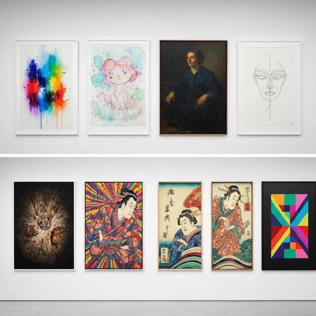
16. Japanese-Inspired Prints
Japanese woodblock prints and wabi-sabi aesthetics bring calm sophistication. A triptych of cherry blossoms, bamboo, and koi fish -- or modern interpretations of traditional motifs -- works beautifully above a low-profile sofa.
17. Mid-Century Modern Geometric Art
Retro shapes, bold primaries, and clean lines. Think vintage travel posters or Bauhaus-inspired compositions. These pair naturally with mid-century furniture (walnut credenzas, Eames chairs) and add playful energy.
18. Botanical Illustration Series
Detailed botanical drawings arranged in a grid -- ferns, monstera leaves, olive branches. This brings the outdoors in without requiring watering. Print on textured paper and frame in thin gold or natural wood for an elegant herbarium effect.
Unconventional Placements and Formats
19. The Triptych
One image divided across three canvases with 1-2 inch gaps between panels. This adds visual rhythm and makes even a simple landscape feel cinematic. Use our custom art generator to create panoramic images designed specifically for triptych display.
20. Above the Fireplace
The mantelpiece is a natural gallery ledge. One large horizontal piece leaning against the wall, flanked by smaller objects (candles, vases), creates a layered vignette. Choose art that echoes the fireplace materials -- abstract stone textures for a stone surround, warm florals for a painted mantel.
21. The Accent Wall Wrap
Extend art onto a painted accent wall. A dark charcoal wall behind the sofa with gold-framed abstracts creates drama. The key is contrast: light art on dark walls, or vivid art on neutral walls.
22. Asymmetric Diptych
Two pieces of different sizes placed side by side. A large vertical canvas paired with a smaller square canvas at different heights creates dynamic tension. Unify them through color or subject matter.
Making It Practical
23. Seasonal Art Rotation
Use a printable art generator to create collections for each season: warm florals in spring, ocean scenes in summer, foliage in fall, snowy abstracts in winter. Print affordably at home and swap them out quarterly to keep the space feeling fresh.
24. Art That Complements Your TV Wall
When the TV is mounted above a console, frame it with art on either side. Two matching vertical prints flanking a mounted TV disguise the technology and make the whole wall feel intentional. Choose muted, non-distracting art for the sides.
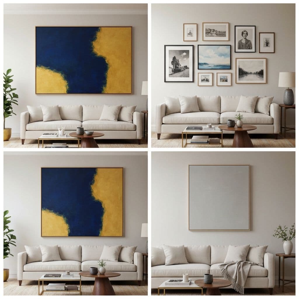
25. The Preview-Before-You-Commit Approach
The most designer move of all: never hang art blind. Use a wall art mockup tool to see exactly how a piece will look on your specific wall -- at the right scale, in the right frame, with the right lighting. This single step eliminates the most common decorating mistakes and ensures every piece earns its place on your wall.
Final Designer Tips
Regardless of which approach you choose, keep these universal rules in mind:
- Art above the sofa should be 60-75% of the sofa's width
- Hang the center of the artwork at 57-60 inches from the floor (eye level)
- Leave 6-8 inches between the top of the sofa and the bottom of the frame
- Match frame style to the room's hardware (black frames with black door handles, brass frames with brass fixtures)
- When in doubt, go bigger -- undersized art is the most common mistake
The best living room art tells visitors something about you before you say a word. Whether that is a bold abstract that signals confidence or a quiet watercolor that reflects your love of nature, the right piece makes your living room feel truly yours.