Choosing the right size wall art can make or break a room. Hang something too small and it looks like an afterthought floating in a sea of empty wall space. Go too large and it overwhelms the furniture below, making the room feel cramped and unbalanced. Yet despite how important sizing is, most people rely on guesswork — and end up with art that just doesn’t feel right.
The good news is that interior designers have long relied on a handful of simple, reliable rules to get wall art sizing perfect every time. In this comprehensive guide, we’ll walk you through the golden ratios, room-by-room recommendations, and a handy reference chart you can save for later. Whether you’re decorating a living room, bedroom, hallway, or dining room, you’ll know exactly what size to choose. If you’re also deciding on a style, check out our guide to the top 8 AI art styles.
The Golden Rule of Wall Art Sizing
Before diving into specific rooms, let’s establish the three foundational principles that professional interior designers use worldwide. Master these and you’ll never second-guess a wall art purchase again.
The 60–75% Width Rule
This is the most important rule in wall art sizing. Your artwork should occupy 60% to 75% of the width of the furniture beneath it. This applies to sofas, beds, console tables, dressers — essentially any piece of furniture the art will hang above. For example, if your sofa is 84 inches wide (a standard three-seater), your art should be between 50 and 63 inches wide. This creates visual balance and makes the art feel intentionally placed rather than randomly hung.
When using multiple pieces in a grouping or gallery arrangement, measure the total width of the grouping, not individual pieces. The combined width should still fall within that 60–75% range. Leave 2–3 inches of spacing between pieces in a grouping for a cohesive look.
The Eye-Level Height Rule
The center of your artwork should be at eye level, which for most people is approximately 57 to 60 inches from the floor. Museums and galleries worldwide use this standard, and it works beautifully in residential settings too. When hanging art above furniture, the bottom edge of the frame should be 6 to 8 inches above the top of the furniture. This creates a visual connection between the art and the piece below it, making them look like a unified design element rather than separate objects.
The Breathing Room Principle
Every piece of wall art needs adequate negative space around it. The wall space surrounding the art is just as important as the art itself. As a rule of thumb, leave at least 5 to 6 inches of open wall on either side of the artwork beyond the furniture edges. This breathing room prevents the art from feeling cramped and allows each piece to have its own visual impact. In rooms with high ceilings, you can increase this margin slightly to maintain proportional balance.
Living Room Wall Art Size Guide
The living room is typically the largest and most visible room in a home, making it the most impactful place to display wall art. It’s also where sizing mistakes are most noticeable. Let’s break it down by the two most common living room scenarios.
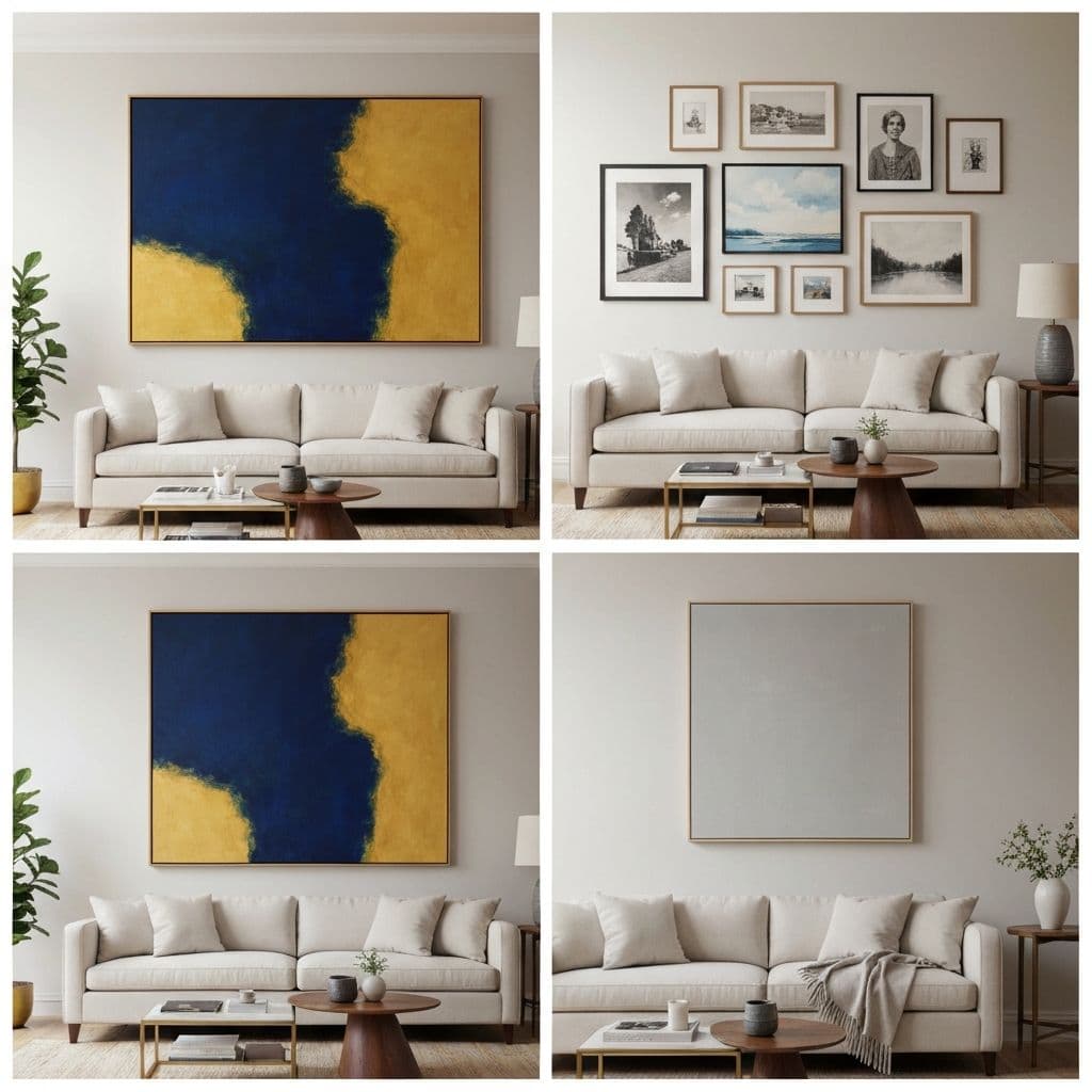
Above the Sofa
The wall above your sofa is prime real estate for statement art. For a single large piece, follow the 60–75% width rule precisely. On a standard 84-inch sofa, aim for artwork between 50 and 63 inches wide, and 24 to 36 inches tall. The sweet spot for most living rooms is a piece around 40 x 30 inches or 48 x 36 inches.
For a two-piece or three-piece set, calculate the total width including spacing. Three 16 x 20 inch pieces with 2 inches between them give a total width of about 52 inches — perfect for a standard sofa. Keep all pieces at the same height and ensure the spacing between them is consistent. Uneven spacing is one of the most common mistakes and immediately makes a wall look sloppy.
Common mistakes above the sofa: Hanging art too high is the number one error. The bottom of the frame should be 6–8 inches above the sofa back, not 12 or 18 inches. Another frequent mistake is choosing art that’s only 30–40% of the sofa width — this looks timid and unfinished. If you’re unsure, err on the side of slightly larger rather than smaller.
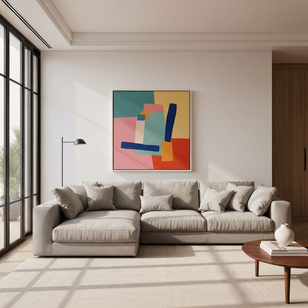
Large Blank Wall
A large, empty wall without furniture beneath it presents a different challenge. Here you have two excellent options. The first is an oversized statement piece — a single artwork 48 inches wide or larger that commands attention and anchors the room. Oversized art works especially well in modern and minimalist interiors. Center it at eye level (57–60 inches to the center) and let it breathe.
The second option is a gallery wall. This arrangement of multiple pieces in various sizes creates visual interest and personality. You can use our gallery wall mockup tool to plan your arrangement on-screen first. Keep the overall grouping to roughly 60–75% of the wall’s width. Use a mix of sizes (try combining one large piece with several smaller ones) and maintain consistent 2–3 inch spacing throughout.
Bedroom Wall Art Size Guide
The bedroom is your personal sanctuary, and the art you choose sets the tone for the entire space. Sizing is critical here because the wall above the bed is typically the first thing you see when entering the room.
Above the Bed
The 60–75% rule applies here with the bed width as your reference measurement. For a queen bed (60 inches wide), aim for artwork that’s 36 to 45 inches wide. For a king bed (76 inches wide), go for 46 to 57 inches wide. A single large piece above the bed creates a clean, hotel-like look that works in both modern and traditional bedrooms.
If you prefer a diptych (two-piece) arrangement, it works beautifully above a king bed. Two pieces of 20 x 30 inches each with 3 inches of spacing gives you 43 inches total — slightly narrower than ideal for a king, so consider going up to 24 x 36 inches each for better proportion. The bottom edges should align perfectly and sit 6–8 inches above the headboard.
| Bed Size | Bed Width | Ideal Art Width | Recommended Size |
|---|---|---|---|
| Twin | 38″ | 23–29″ | 24 x 18″ |
| Full | 54″ | 32–41″ | 36 x 24″ |
| Queen | 60″ | 36–45″ | 40 x 30″ |
| King | 76″ | 46–57″ | 48 x 36″ |
| Cal King | 72″ | 43–54″ | 48 x 32″ |
Bedroom Accent Wall
Not all bedroom art goes above the bed. An accent wall opposite the bed or beside a reading nook is an excellent secondary location. For accent walls, slightly smaller pieces (16 x 20 or 20 x 24 inches) work well because they complement rather than compete with the main above-bed artwork. Position them at eye level, and consider a grouping of 2–3 smaller pieces for visual variety.
Dining Room Wall Art Sizing
The dining room presents unique sizing considerations because the art is typically viewed while seated. This means the optimal hanging height is slightly lower than in other rooms — aim for the center of the artwork at 54 to 57 inches from the floor rather than the standard 57–60 inches.
Use the dining table width as your reference for the 60–75% rule. A standard rectangular dining table is about 72 inches long, so artwork should be 43 to 54 inches wide. For round tables, use the table diameter. Horizontal (landscape) orientation generally works better than vertical in dining rooms because it echoes the horizontal line of the table and chairs, creating harmonious proportions.
If the art is on a wall adjacent to the table rather than directly behind it, you can go slightly smaller (40–50% of the wall width). Dining rooms are also excellent candidates for a horizontal series of three matching prints — think botanical illustrations or abstract pieces that share a color palette.
Hallway & Entryway Art Dimensions
Hallways and entryways are narrow spaces that require careful proportioning. The key challenge is that you’re working with less wall width but often plenty of vertical space.
For narrow hallways, vertical (portrait) orientation is your best friend. A tall, narrow piece draws the eye upward and makes the space feel taller without encroaching on the limited width. Pieces in the 12 x 16 to 16 x 24 inch range work well for standard hallways. If you have a particularly long hallway, consider a horizontal series of 3–5 small matching pieces (8 x 10 or 11 x 14 inches each) arranged in a straight line at eye level. This creates a gallery-like experience that gives the hallway purpose and character.
Entryways or foyers with a console table should follow the standard 60–75% rule based on the table width. An entryway without furniture can accommodate a single statement piece centered on the wall at standard eye level. Avoid going too large in entryways — you want the art to welcome, not overwhelm.
Gallery Wall Layout Ideas
Gallery walls are one of the most popular ways to display art, but they require more planning than a single piece. Here are three proven layout approaches:
1. The Grid Layout: Equal-sized pieces arranged in a perfect grid (2 x 2, 2 x 3, or 3 x 3). This creates a clean, modern look. All frames should be identical, and spacing between pieces should be exactly 2 inches. A 3 x 3 grid of 12 x 12 inch pieces with 2-inch spacing creates a 40 x 40 inch grouping — perfect above a medium sofa.
2. The Salon Style: Mixed sizes arranged asymmetrically with a central anchor piece. Start with one large piece (16 x 20 or larger) slightly off-center, then build outward with smaller pieces. Keep the overall grouping contained within an imaginary rectangle. This style feels collected and personal, perfect for eclectic or bohemian interiors.
3. The Horizontal Line: Three to five pieces of the same height but varying widths arranged in a straight horizontal line. This works beautifully above a long sofa, sideboard, or in hallways. Use consistent vertical spacing (2–3 inches) and align all pieces along their center line for a polished look.
Regardless of layout, always plan your arrangement on the floor or with paper templates on the wall before putting any nails in. Measure twice, hang once.
Printable Wall Art Size Chart (Quick Reference)
Save this chart for quick reference whenever you’re shopping for wall art or planning a new arrangement:
| Location | Furniture Width | Ideal Art Width | Hanging Height (center) |
|---|---|---|---|
| Above sofa (3-seater) | 84″ | 50–63″ | 6–8″ above sofa |
| Above sofa (2-seater) | 60″ | 36–45″ | 6–8″ above sofa |
| Above queen bed | 60″ | 36–45″ | 6–8″ above headboard |
| Above king bed | 76″ | 46–57″ | 6–8″ above headboard |
| Above console table | 36–48″ | 22–36″ | 57–60″ from floor |
| Dining room wall | 72″ (table) | 43–54″ | 54–57″ from floor |
| Hallway (narrow) | N/A | 12–16″ | 57–60″ from floor |
| Large blank wall | N/A | 48″+ or gallery | 57–60″ from floor |
Final Tips Before You Hang
Before you commit to a nail in the wall, here are a few final pieces of advice from our design team:
- Use painter’s tape to outline the art dimensions on your wall before hanging — or better yet, use a wall art mockup tool to preview the art digitally first. Stand back and evaluate the proportions from across the room.
- Consider the frame — frame width adds 2–4 inches per side to your total dimensions. Factor this into your calculations.
- Light matters — art positioned near natural light sources will have more visual impact. Avoid placing art in direct sunlight to prevent fading over time.
- Scale with ceiling height — rooms with 10-foot or higher ceilings can support larger art and higher hanging positions. Adjust the eye-level rule upward by 2–3 inches in tall rooms.
- When in doubt, go bigger — oversized art is a current design trend, and it almost always looks more intentional than undersized pieces.